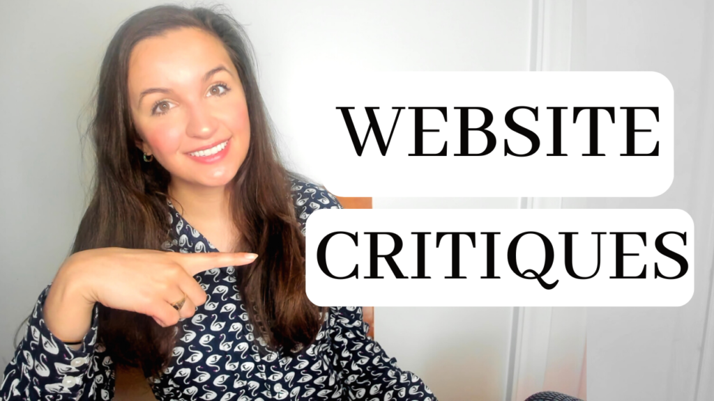
As a wedding photographer, having an outstanding website is so important and so I wanted to do a wedding photography website critique for fun. I put together a critique of a few websites with my honest first impression and feedback. There is so much I am still learning about the wedding photography industry, but I have definitely created my fair share of websites over the years and have learned a few things when it comes to photography website designs and creating a website that stands out. In this video I share all of my wedding photography website tips and advice!
So I have never seen any of these websites before making this video, just for full disclosure.
Watch the full video here:
Some key takeaways:
- If you are a travel photographer, say “travel” , and if you are not, say “serving” __.
- 7-8 menu options might be one too many options. I’ve heard five or six is a sweet spot.
- My first thought is, who are you? What’s your name? And I don’t, don’t see that anywhere, make sure to introduce yourself right away.
- I’m also noticing is there’s a lot of sentences ending in exclamation, exclamation, exclamation. So it feels like you’re shouting.
- The ‘click that button below’ is kind of an outdated thing with today’s websites.
- If I click book appointment, it takes me straight to the contact page. Love that.
- Each gallery has a different format, so I think it might be more consistent if they were all the same kind of format.
- Contact page is almost creating a lot of work for potential clients to to think about when they want to inquire with you, make it less questions.
I think it looks great and I love your website, so I hope this was helpful. I would love to do more wedding photography website critiques, if you’re interested in me critiquing your photography business website, we have a comment down below with a link to it and I will go ahead and pick more and do more over the next couple months.
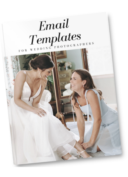
I do have free email templates for photographers if you want to download those down below. This was super short and sweet video, but I hope it helped you by giving you some insight into getting your website to be incredible!
Make sure to subscribe and we’ll see you guys later here on YouTube!
If you enjoyed this blog post or Youtube video, you might also enjoy my email templates for wedding photographers, you can get here:
as well as other freebies here on the site.
And if no one had told you lately, I believe in you and your business.
–
More links:
💛 Join Facebook Group for Photographers: https://www.facebook.com/groups/651847955241023/
✅ Freebies for Photographers: Wedding Consultation Cheat Sheet: https://samiaeducation.ck.page/462825f5df
Wedding Pricing Guide: https://samiaeducation.ck.page/00a165bd7b
Wedding Day Timelines: https://samiaeducation.ck.page/c683c39a62
Instagram Reels Guide: https://samiaeducation.ck.page/00e1d300eb
Wedding Schedule Spreadsheet:https://samiaeducation.ck.page/77176e76aa
Camera Equipment List: https://samiaeducation.ck.page/8a8118c50f
Email Templates for Wedding Photographers: https://samiaeducation.ck.page/d2f1322ae7
💛 50% OFF Honeybook: http://share.honeybook.com/gG8Fv
Full Honeybook Walkthrough Youtube Video: https://youtu.be/3C4piRcf8eo

